
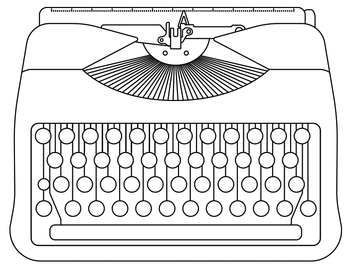
The tangled history of the keyboard
When you’re writing with a pen or pencil, of course you can use any character you want. But when the typewriter was invented, the keyboard had to be a manageable size, so manufacturers needed to choose carefully which characters they’d be able to fit on it. There were also heavy mechanical constraints: chiefly the need to fit in all the levers that would actually whack each character through the ribbon and onto the paper. The designers therefore had to make compromises: lots of characters were left off the keyboard, and others were combined if they looked similar.
For example, on many portable typewriters, there’s no number 1, the thinking being that (in the typeface used – typically something like Courier) the lowercase letter l could double up to that task: Bet you didn’t notice that the zero there isn’t actually a zero either – it’s a letter O.
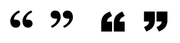
 In the same way, typewriter designers figured a typist didn’t really need the fine distinction between the “sixty-six” opening quote
“
and “ninety-nine” closing quote
”
that we were taught when learning to write – one single glyph could suffice for both, and so the straight double quote glyph
"
was born. Having been created, that character could then also be used for the inches mark (traditionally a mathematical double prime: ″) because that was a similar shape, and for the ditto character (〃) too, for the same reason.
When it came to single quotes, there was the same scope for efficiency: the opening quote ‘, the closing quote ’ (note that the closing single quote was always the same character as the apostrophe ’ anyway) and the feet mark (a single prime: ′) could be combined into the straight-up
'
glyph. What’s more, if they made that character tall enough, they could do away with the need for an exclamation mark key too: the typist could key a full stop, backspace, then add a
'
…like this:![]() Fast-forward to the invention of electronic typewriters, and then computers. We were no longer bound by the mechanical restrictions under the keyboard, but nobody would want to learn to type all over again on a radically different keyboard, so the majority of the existing layout had to be retained, and we just gained a few extra k
Fast-forward to the invention of electronic typewriters, and then computers. We were no longer bound by the mechanical restrictions under the keyboard, but nobody would want to learn to type all over again on a radically different keyboard, so the majority of the existing layout had to be retained, and we just gained a few extra k eys around the edges. But with key combinations, and key codes, and other software-based methods, we now had access to far more characters than were physically on the keyboard … in fact, any character that the font designer had seen fit to create.
Of course, key combinations and codes take time to learn and memorise, and take more time to type than hitting a single key anyway. It didn’t matter much for characters that you were only going to use occasionally to begin with, like the per-mille ‰, but if we wanted to regain access to what should be very common characters – like separate opening and closing quotes – it was going to be hopelessly inefficient. (Not to mention that many people who’d learned to type in the intervening period were now practically unaware that these were supposed to be different characters in the first place!)
So, while simple computer applications that treated keyboard input literally still gave you the
'
character when you hit the
'
key on the keyboard (just like a typewriter), the developers of more sophisticated text-handling software – word processors and desktop publishers – attempted to apply some sort of context-based automation. They figured they should be able to tell whether a typist really needed
“ or ” or ‘ or ’
based on what occurred around it.
The solution they settled on was essentially this:
' or "
with white space to the left of it and letters, numbers, or certain other punctuation marks to the right must be an opening quote, and could automatically be converted to
‘ or “
![]() Then,
Then,
' or "
with letters, numbers, or certain other punctuation marks to the left of it and white space to the right must be a closing quote, and could automatically be converted to
’ or ”
And finally,
'
with letters or numbers on both sides of it must be an apostrophe, and could automatically be converted to
’
![]() This they called “smart quotes.”
This they called “smart quotes.”
Of course, this is a pretty simplistic algorithm, and while it makes the right decision most of the time, there are instances where what you want is not what it thinks you want.
For example, what about terms that begin with an apostrophe? Recall that one of the main uses of the apostrophe in English is to indicate omitted letters in a contraction, so when you shorten and to n, that takes an apostrophe before and after: fish ’n’ chips, mac ’n’ cheese, sex ’n’ drugs ’n’ rock ’n’ roll, but of course the smart quotes algorithm sees you type
'n'
and thinks – Aha! Opening and closing quotes! – and turns it into ‘n’. You’ll see that on chip shop signs up and down the country. If you try to contract them to ’em it makes the same mistake and gives you ‘em. Which looks ghastly. And the same thing occurs when you need to contract a year – say 1983 into ’83.
Of course, how noticeable all this is depends on the font you’re using and at what size. In some, like Georgia, or Arial Black, the opening and closing quotes are very different tadpole-like shapes, or squarish blocks with long tails coming off them:
 But in many other fonts (Verdana, for example, or Palatino), they’re a sort of wedge that’s only slightly wider at one end than the other, so the smaller the point size, the harder it is to see:
 Then what happens if you need to talk about feet and inches? Remember that technically these should be prime characters – but of course lots of fonts don’t actually have ′ or ″ in them, and even in those that do, the characters are off in some obscure mathematical code range and hard to find. Letting the software turn typed
6'3"
into 6’3” is pretty ugly and this is actually one instance where the unconverted straight quotes are actually preferable. If you want to be sneaky smart, manually italicising the straight quotes approaches the look of the primes pretty closely:
6'3"
– and may be the least-worst option.
Very few fonts at all have the ditto mark in them … but thankfully these days we have little call to use it anyway. But if we did, the unconverted straight double quote (perhaps italicised, like for the inches mark) would be a perfectly good solution.
Appendix: connected script fonts
Connected script fonts have a terrible time dealing with apostrophes:
 Firstly, many of them are cheapo, and don’t actually have a separately-designed curly apostrophe ’ in the first place, only the straight one
'
(which looks way more out of place in the middle of a string of very slanted cursive letters than it does in a regular text face), and secondly, they just don’t stay connected when you drop a punctuation mark into the middle of a word. Think about what you do (assuming you have nice joined-up handwriting) when you hand-write a word like that’s, for example. Many of us would start off writing something like lhals and then go back and put in the crossbars of the two ts, and the apostrophe ’. So the main stroke of the t connects directly to that of the s, and the apostrophe is fitted in somewhere above them afterwards.
But of course when you type, all the characters are placed in sequence. If a job has specified a connected script font, there’s presumably a reason for that based on wanting the text to look at least vaguely like something handwritten. The example above falls down on that front, precisely because of that massive space around the apostrophe. And script fonts tend to be part of display headings, so set quite large where that sort of thing will stand out.
Tediously, the only solution is to select the apostrophe and the character before it, and manually kern them together until the characters before and after the apostrophe connect up again: Next time … dashes!
A version of this article was previously published on the Purple Agency blog, but subsequently lost therefrom. This WordPress platform has a built-in feature that applies a smart-quotes algorithm causing the very errors I describe in the text above. The only way I found around this bug (short of BUYING a plug-in to disable it) was to call out what should be inline characters into separate paragraphs and apply the “preformatted” style to them. So, sorry about that. Technology, eh? Always thinks it’s smarter than us, and always wrong.
